Thursday, January 27, 2011

Repost of Last Question (last one my picute covered the text)

      My favorite object at the Victoria and Albert museum is not an object actually. I found the John Madejske Garden in the center to be a wonderful place to sit outside and relax on a nice day. Key word meaning nice day when it’s not raining.

But, if I had to chose my favorite piece from all the collections I would chose the sculpture of “Neptune and Triton” by Giovanni Lorenzo Bernini, dating about 1622-1623. On a large shell, Neptune is life-size holding his trident in a firm gesture of command, straddling his son the sea-god Triton, who blows on a conch shell. The interlocking curves of the two figures, and their aggressive energy, generate an excitement of them commanding the seas. “The sculpture was originally set surrounded by elaborate fountains and set above waterfalls at the upper end of a large oval pool in the garden of the Villa Montalto in Rome. There, Bernini fully exploited the presence of open air, light, and water” (taken from the description card).
At first I walked right past this piece but upon walking back through this gallery a few more times I found myself stopping to look at it each time. I’m not sure why this speaks to me. It could be my interest in Greek and Roman mythology or that seeing a father son team reminds me of my family’s “team” persona. I would go back for more contemplation to examine the detail of the sculpture further and to look at more mythical figure sculptures. 
1)      Logo


The Victoria and Albert Museum has one of the most unique logos of all the museums in London. Personally, this is my favorite logo because of its simplicity and classic serif type face. The acronym for Victoria and Albert is a perfect way to simplify a long title and to create a memorable logo (short and simple). At first glance I didn’t even notice the removal of the left slant of the “A” because of the ampersands strategic placement, including its serif creating the cross bar of the “A”. 
In relation to the overall architecture and collections, the logo exudes elegance, history, and extravagance. The elegance in the logo is shown by the continuity of thickness in the left slant of the “V” and the right slant of the “A”. The architecture of the entire building inside and out is very elegant, from the brick/stone work to the marble columns and perfectly tiled floors. The simplicity and royal feeling of the logo as representing a historical theme derives from the fact that the whole museum has historical significance in both the collections and the building itself. Lastly, I think the extravagance of the interior (especially the grand chandelier) is represented in the logo by the bold choice to remove a portion of the A and the use of the ampersand.   
Overall, I am very impressed by the logo and I will most likely compare other museum logos to the Victoria and Albert Museum.

2)      Cast Courts
My immediate impression of the Cast Courts gallery was “Oh wow”. The amazing grand entrance and elaborate detail of the cast was very impressive and even left me speechless. I’m glad I went into gallery 46a first because of all the grand plaster work (especially the two pillars) and the amount of artifacts in that gallery. If I had gone into gallery 46b I probably wouldn’t have been as impressed since many of the pieces were missing or covered due to the ongoing reconstruction of this gallery.
This collection of plaster work provides an educational means to visually teach European history through plastered artifacts that cannot be taken from their original location. In addition I think this collection also provides education on the art of plastering. Not necessarily what is plastering or how to plaster, but teaching how the use of plaster is a way to recreate or copy an important piece of history to be shared with the whole world.


3)      Isotypes
The isotype icons/symbols have more personality and excitement in the objects and depictions than in the international system of signs. Isotype symbols are also more elaborate and colorful. For example in the portrayal of the unemployment the man figures are wearing suits and carrying briefcases and in the TB poster and voting poster there are many colors such as red, orange, yellow, black and blue.

 In contrast to the isotype, the international system symbols are generic, simple, and quite honestly boring; although they do serve a purpose that is universal across all languages and cultures. Besides the overall look of the isotype, the graphic depiction of large numbers is very clever, by the use of smaller figures in greater numbers rather than using larger figures. (See picture below).  

I think the method of using both graphics and text communicates to a far larger group of individuals rather than text alone. Isotypes are great teaching materials, especially for those nations in poverty with low literacy rates. My favorite example is the Tuberculosis poster (see picture below).


The poster teaches how one would get TB (transfer), how/where to get treatment, and how TB affects ones lungs. I think this is a great teaching tool for areas affected by TB that have a high population in poverty with low literacy because even without reading the text, the pictures are clear illustrations.
Overall, isotypes are very legible, easy to read, and add excitement to ordinary representations.

4)      Pattern
The pattern I chose from the Islamic section was titled chimneypiece from Istanbul, Turkey dated 1731. (See picture below).


The glazed tile intrigued me because of its intricate pattern and colors. Each larger tile had both natural/organic stokes along with geometric circles imbedded between the natural lines. The tiles as a whole are arranged on a grid to produce a repeating beat of either a circular-ish or cross pattern depending on how you look at it. The smaller tiles on the other hand had mostly natural lines and very few geometric lines. These comprised the boarder of the chimney. I think since the smaller tiles had only organic lines that it was appropriate they create the rectangular boarder around the chimney. I really liked the figure/ground contrast that was used, the white background really made the colorful thick lines and flowers stand out. Looking at the tile work as a whole it looked like there was a face in it. There are eyes, a nose, and the chimney opening is the mouth. I was baffled that someone would want this in their home. I think it was kind of scary.   

The ironwork pattern I chose was piece used at a gate in Northern Italy during the 17th century. (See picture below).

This piece also used both natural/organic lines along with geometric lines. On the top and bottom there are beautiful, whimsical stokes depicting vines. In the middle, there are vertical lines that seem to create rectangles because of the figure ground nature. In addition, diagonal lines starting at the top converge to the lower center. Unlike the very cheerful and colorful Islamic piece the ironwork was purely black. The black gate against the white wall really allowed the figure/ground contrast to emerge in order to see the detail in the vines and leaves. This particular piece had no repeating pattern or constant beat. In the Islamic tiles I liked the pattern because of the way it came together as a whole, whereas in the iron piece I think the lack of continuity was perfect for its use and displaying of the craftsmanship.

5) The Underground     

The London Tube and its logo is a distinctive feature to London city life. The iconic red circle and the blue bar across with the tube station name establishes an identity for London’s transit. The tube in an elaborate network of underground trains unlike that anywhere in the world, especially Madison. The Madison metro system uses simple, single story buses with a distinct logo of the large M with the word Metro beneath and stripes of dull colors of yellow, red, and blue. The London bus logo is not any more exciting than Madison’s but the red seems to be more vibrant in the iconic circle and cross bar sign. The London bus logo could also be more exciting because the buses themselves are more interesting since they are “double decker”. To me although the logo and buses are more interesting in London, the bus stops are quite similar. In Madison and in London smaller bus stops have just a sign indicating the bus route number and at larger bus stops there are tiny shelters with maps of the routes and even a small bench. The only difference at the bus stops is, in London there are stations to buy bus tickets whereas, in Madison you would pay the bus driver (so I’m told). 

6)      My favorite object at the Victoria and Albert museum is not an object actually. I found the John Madejske Garden in the center to be a wonderful place to sit outside and relax on a nice day. Key word meaning nice day when it’s not raining.

But, if I had to chose my favorite piece from all the collections I would chose the sculpture of “Neptune and Triton” by Giovanni Lorenzo Bernini, dating about 1622-1623. On a large shell, Neptune is life-size holding his trident in a firm gesture of command, straddling his son the sea-god Triton, who blows on a conch shell. The interlocking curves of the two figures, and their aggressive energy, generate an excitement of them commanding the seas. “The sculpture was originally set surrounded by elaborate fountains and set above waterfalls at the upper end of a large oval pool in the garden of the Villa Montalto in Rome. There, Bernini fully exploited the presence of open air, light, and water” (taken from the description card).
At first I walked right past this piece but upon walking back through this gallery a few more times I found myself stopping to look at it each time. I’m not sure why this speaks to me. It could be my interest in Greek and Roman mythology or that seeing a father son team reminds me of my family’s “team” persona. I would go back for more contemplation to examine the detail of the sculpture further and to look at more mythical figure sculptures. 

Saturday, January 22, 2011

The Science Museum and its exhibits

1)      Critique the Logo


The Science museums logo is a unique presentation of the words science and museum. I’m not sure what the font type is but I think it suits the mission and purpose of the museum. It has a sort of computer and technology feeling to it which is exactly what the contents of the museum consists of. Although, the contents of the museums is technology of the past whereas I think the logo seems to be more futuristic from the perspective of today’s technology.
I think the logo is appropriate for some audiences because those who seek out the science museum will understand the interpretation of the logo. On the other hand, I saw most people at this museum bring their children and I think this would not be appropriate for children. The font type and the way science and museum are broken up into a box-like shape would make this hard for children to read.  

2)      Navigation
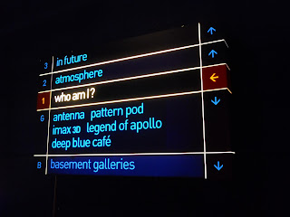
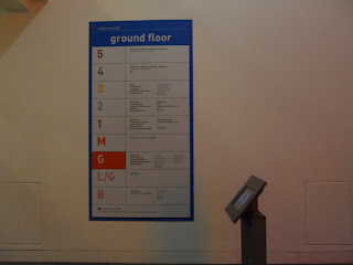
I thought the general navigation around the museum was generally well done. There were plenty of signs directing to restrooms, other exhibits, the shop and café. The clear paths were easy flow from one exhibit to the next was nice too although, there were so many routes to take I felt flustered at times because I didn’t know which way to go.
My favorite part of navigating through this museum was having the map available. On one side there was color coded maps of all the levels which perfectly complimented the other side that had an explanation of each exhibit. It also wasn’t too big. Well done. 
 These navigation board was found at every entrance/exit. This was a great tool to find which exhibits I wanted to see.

3)      Shop/café
The shop and café certainly is an extension of the brand. The same futuristic font type is seen in the entrance and directions to the shop and café. For example, inside the shop the writing above souvenirs directly relates to the mission of the museum with its phrase “the science of shopping”. (see below)

 Also, in the gift shop there were lollipops with the museum logo. I think this was a great marketing tool of the brand the museum has made for itself. (see below)


The cafés sign reinforced the brand but I’m not sure what the food did for the brand. I did not get a chance to see what was on the menu. To reinforce the brand even further it would be a good idea to sell “science” sounding products.


4)      Display cases
The most traditional and logical museum display cases were the glass enclosure type. I saw these throughout the museum. These served to protect the historical piece from damage from visitors or to incubate at a certain temperature (for example extremely old wood that may decay).

Picture of the DNA model Watson and Crick created at Cambridge University in 1951.  

 For the most part the text integrated into the display worked well with each exhibit but I disliked many of their attempts. I thought in many displays the text was much too small to read. I do not have poor eyesight but I felt as if I had to get very close in order to read the description. One example was in the “Making the Modern World” exhibit on the second floor where they had many small models. The text was much too small and I found it difficult to follow which description went with which particular object. (see below)
 

Along with the small text, the position of the text cards was poorly done. Some were way too high to see and some were so low I felt as if I had to sit on the ground to read them.

Another type of display was a more modern way to engage visitors. This type of display used interactive forms such as computers to learn about science. For example, the “Who am I” exhibit used this form quite a bit and the “In the Future” exhibit used this form to display the possibilities of the future. Generally, I enjoyed this type of display more than the traditional form because I felt more engaged in the topic and I wasn’t exhausted after reading so much text.
"Who am I" exhibit with all the interactive learning stations

"In the Future" exhibit.


5)      Exhibits
My favorite exhibit was the “Who am I?” exhibit. When first walking upstairs you are greeted with a huge white screen/white panel. (see below)


This was impressive because of its huge size and when you stepped on it, small red dots appeared where you are standing. Once inside I wasn’t sure what to think. There are these large blobs (not sure what to call them; see picture below) that contain small computer screens that have different personality tests. Each blob is specific to what makes you human. Here some example of each station: my body, my face, my sex, and my personality.


My favorite pieces in the exhibit were the brain slices from normal and Alzheimer’s patients, the first pace maker, and a representation of how long chromosome X is. I thought the way they choose to display these and other pieces was really unique. They used slender cases one after another. This reminded me of bookcases which was easy to wonder in and out of (see picture below). I did not like how small a lot of the print was on the descriptions, especially pieces that we high up or really low.


The color scheme worked with the exhibit but I would have more vibrant colors in it. The white, silver, and hint of red with blue twinkle lights above were not distracting from the pieces in the exhibit but splashes of blues, red, purples, or yellows would have made it more exciting. Putting those colors in the entrance would have made the exhibit more inviting I think.
                               
For me this exhibit was most memorable because I am a biology major and learning about what makes us human and unique from one another is an area of science I love. Other than my own personal likes of human biology the interactive aspect of the exhibit made it unique and brought me back to being child playing interactive games.  

6)      Facts

One fact that I found most interesting was that the X chromosome is the longest in the human genome. It carries over 1000 of the 23,000 human genes. The base pair (DNA) code is in its 22nd book volume and scientists are still not done decoding the entire chromosome. During replication it takes your body 16 hours to read and copy. Mistakes are rare, but can lead to disease such as Duchene’s Muscular dystrophy.